SpectroDraw Pro has a new look!
Published: May 27, 2026
For a long time, I thought the word “Pro” had to mean something advanced, intimidating, and difficult to understand. I imagined a tool with a complicated feel, something built for experts first and everyone else second. SpectroDraw Pro was originally designed with that mindset, with inspiration drawn from the dense, powerful look of Adobe's After Effects.
| The old interface | The new interface |
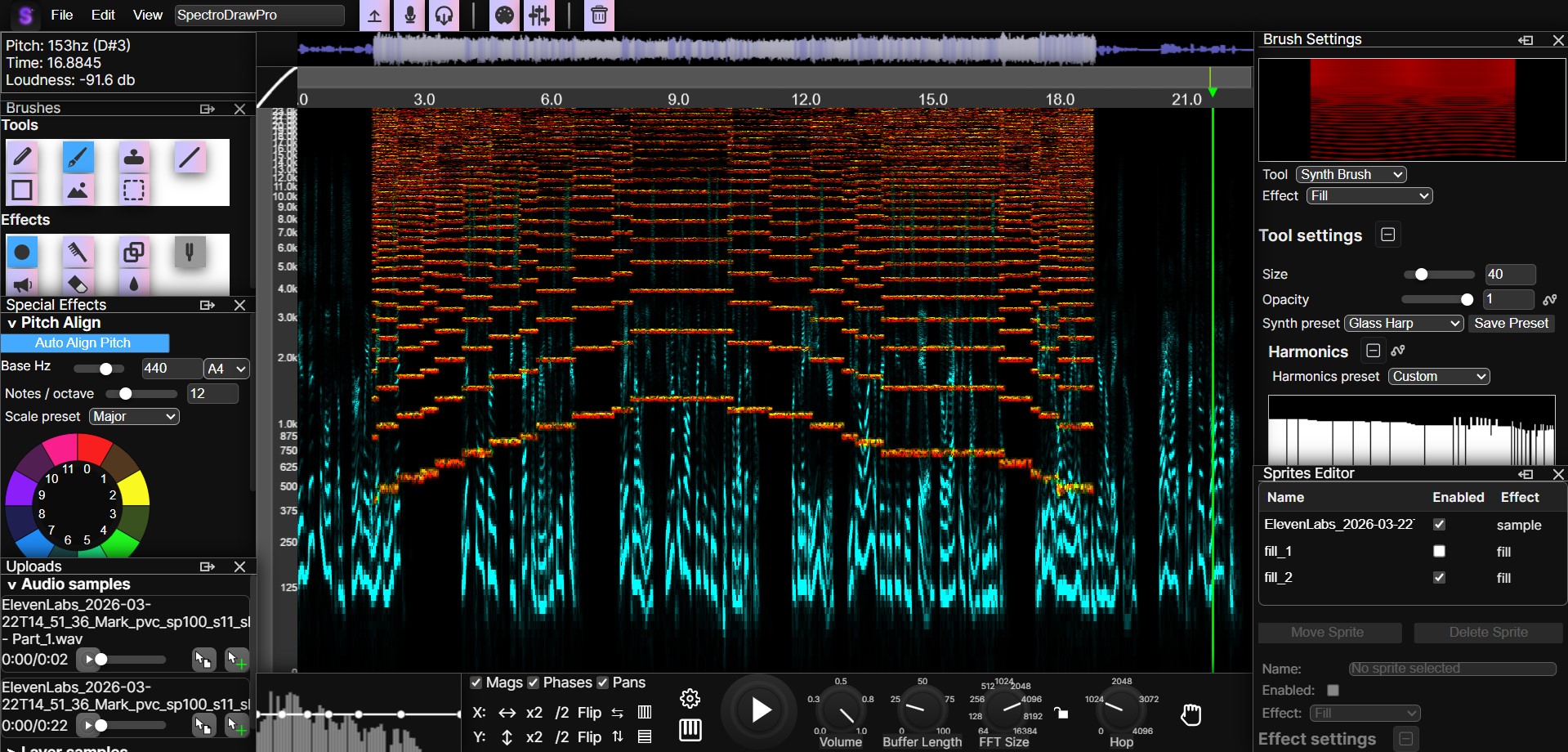 |  |
That vision has changed. I have modernized SpectroDraw Pro so it feels cleaner, more consistent, and much easier to enjoy at a glance. The biggest visual shift is the new brand color: purple now ties the whole interface together and gives the app a stronger identity.
Along with the new color direction, I increased the border radius across the UI to make everything feel softer and more contemporary. These changes may seem small on their own, but together they create a much more polished experience. The interface now feels less harsh, more unified, and more inviting to use.
I have also been fixing many smaller bugs behind the scenes, like the glitchy spectrogram overlay canvas, moving sprites, creating new projects, and more. All of this was only possible thanks to the feedback from users in the SpectroDraw Pro early testers Discord server. They have also suggested that I create tutorials on each feature in SpectroDraw, which I will do over the next weeks.
This update is more than just a visual refresh. It is a step toward making SpectroDraw Pro feel like a modern creative tool that is powerful without feeling overwhelming. A huge thank-you goes out to everyone who tested early and shared feedback. Join the early testers server at dsc.gg/spectrodraw.
Go to spectrodraw.com/app